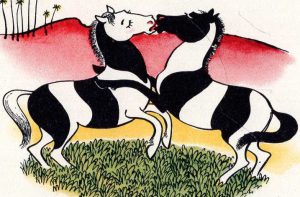
BLUNT -1940 Bet It’s A Boy; different production processes
Not all four editions issued during 1940 and 1941 of Betty Bacon Blunt’s wordless novel, Bet It’s A Boy, used the same production process.
I lack the technical knowledge regarding the printing process and invite comments regarding the images below. Please contact me at
wn at worldessnovels.com
Credit will be given for any information received.
It is my assumption Blunt drew the black lines with an ink pen and then added the blue and yellow with a water colour brush. Then images were reproduced using some type of photo-lithographic method.
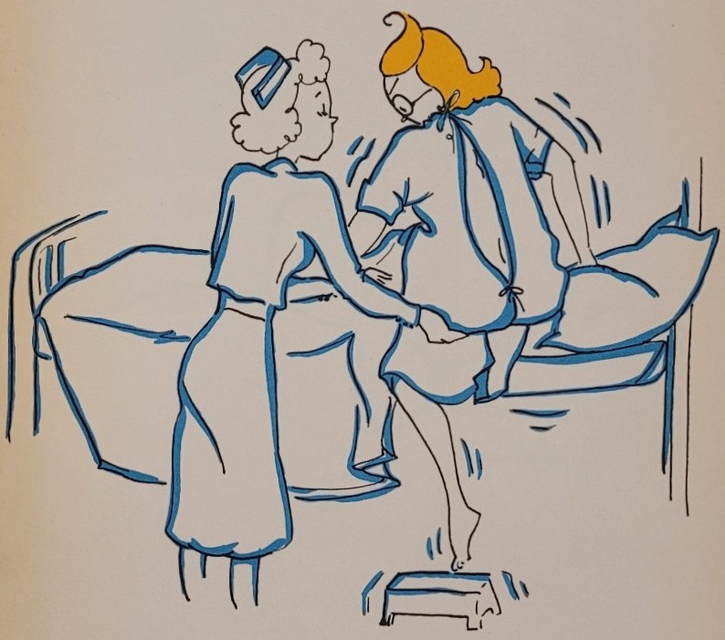
production values of the four editions.
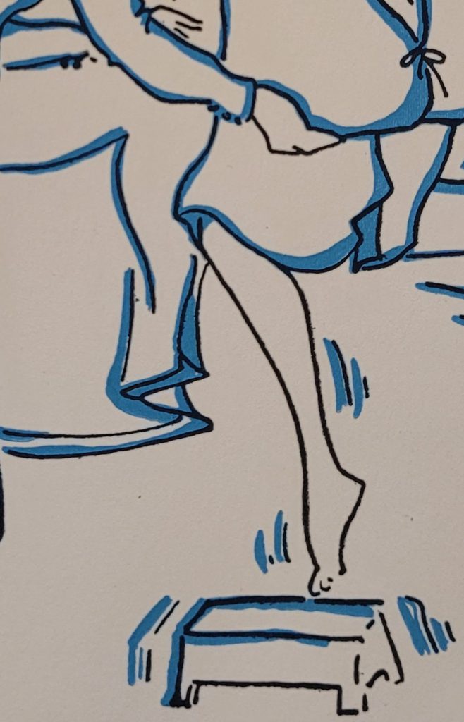
The following image details are taken from each of the four editions. Attention is given to the black line drawing, particularly at the top of the woman’s calf and on the upper shin. Also compare the blue shading. This is like “Spot the Difference”:
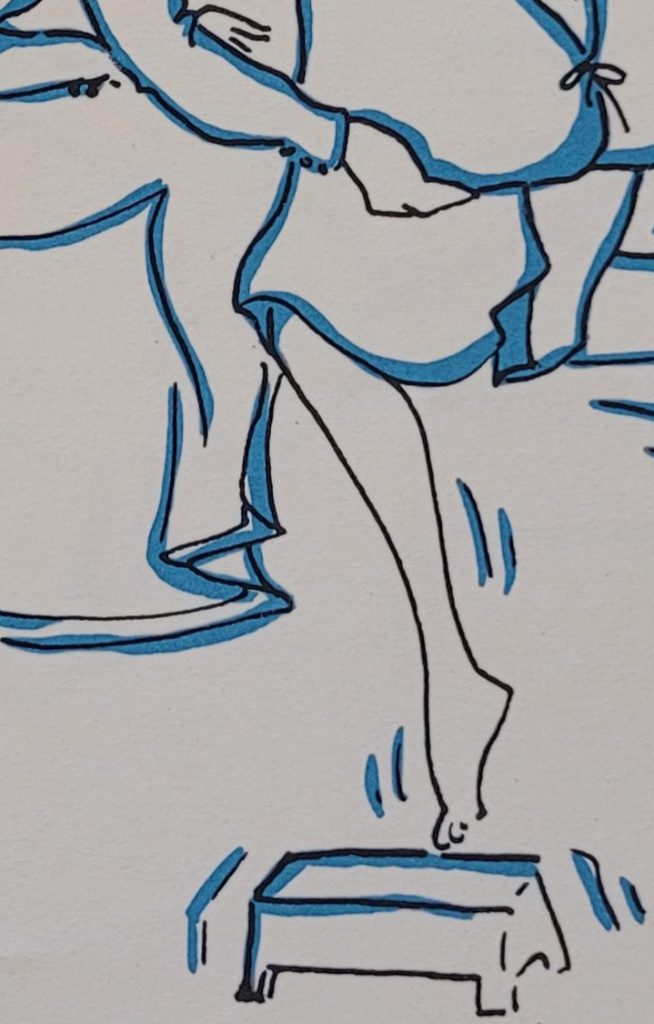
shading appear to be the same as above ie presumably
both used the same printing plates or negatives.
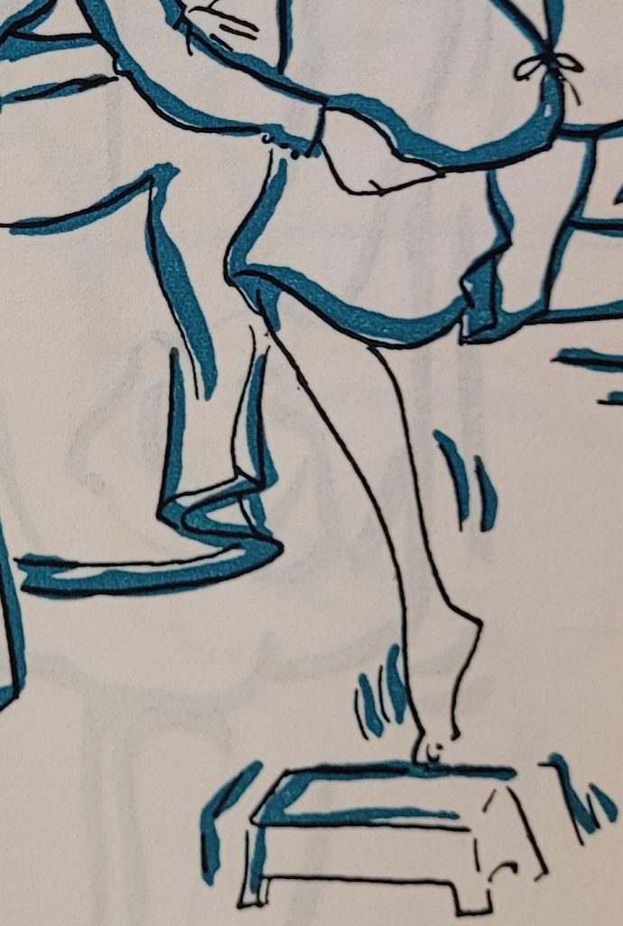
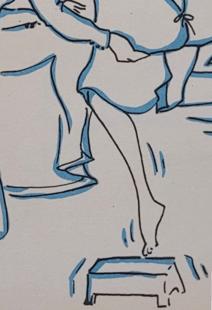
editions above. Note how the line at the top of the calf butts in as
opposed to flowing smoothly like the first two.
Also note the blob towards the top of the shin – it appears
as if the person doing the tracing stopped and started again.
shakiness of the Perfect Bound but they are a bit heavier
and the blue shading is slightly different than the first two.
COMMENTS
If you disagree with something on this page, have an improvement, or have a comment please contact me
wn at wordlessnovels.com
Any information used will be given a credit line.