Richard Floethe’s wordless novel, Summer Holiday, is a charming summer romance – the story of an artist meeting a girl on a sailing holiday. Hand coloured; it is one of the few happy, wordless novels.
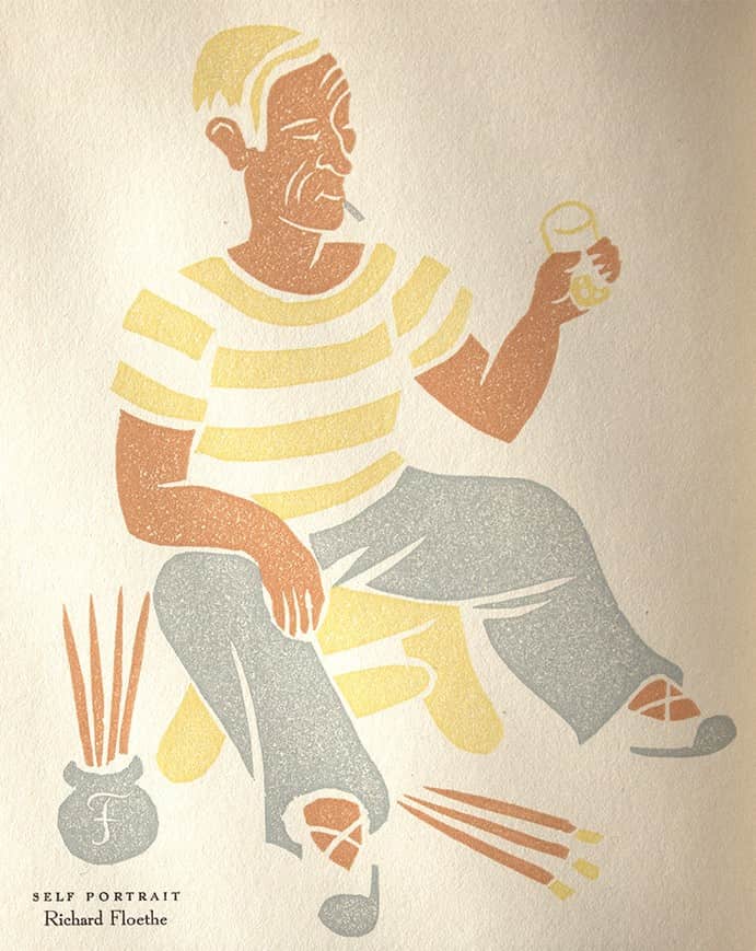
Self Portrait for a Notice in The Colophon New Series
1935 Autumn; printed from the blocks in three colours.
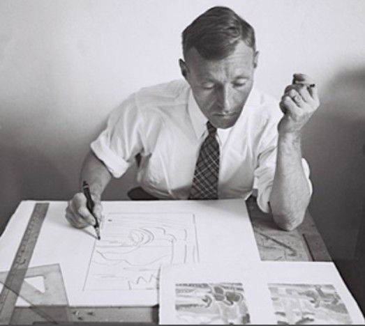
According to a son, “Floethe” is pronounced “flirta”.
NOTE: Floethe and Summer Holiday, was not included in Wordless Books: The Original Graphic Novels as David Beronä was not aware of its existence at the time Beronä’s book was published in 2008.
While pre-1960 wordless novels predominantly tackle grim social realism, Floethe’s work departs from this tradition with a noticeably lighter tone. Although some might question whether these stories belong on a site focused on the genre, this site takes an inclusive approach: if a work meets the strict definition of a wordless story, it belongs here, regardless of its mood.
Floethe background
Richard Floethe (1901-1988) studied with Klee and Kandinsky at the Bauhaus, taught at the Ringling School of Art and Cooper Union, served as art director of Works Progress Administration (WPA), and was renowned as a graphic artist and book illustrator. During his lifetime he illustrated nearly 100 books, many written by his wife, Louise Lee Floethe.
Richard Floethe is the noted American artist whose imaginative illustrations for Tyl Ulenspiegle and Pinocchio have twice won him the Limited Editions Club International Contest, and whose charming illustrations for children have gained renown in the trade book field.
From the publication announcement put out by Brookdale Press for Summer Holiday.
Floethe used sailing themes a number of times over the years; an example of which is this notice in The Colophon New Series 1937 Vol 2, No 4.
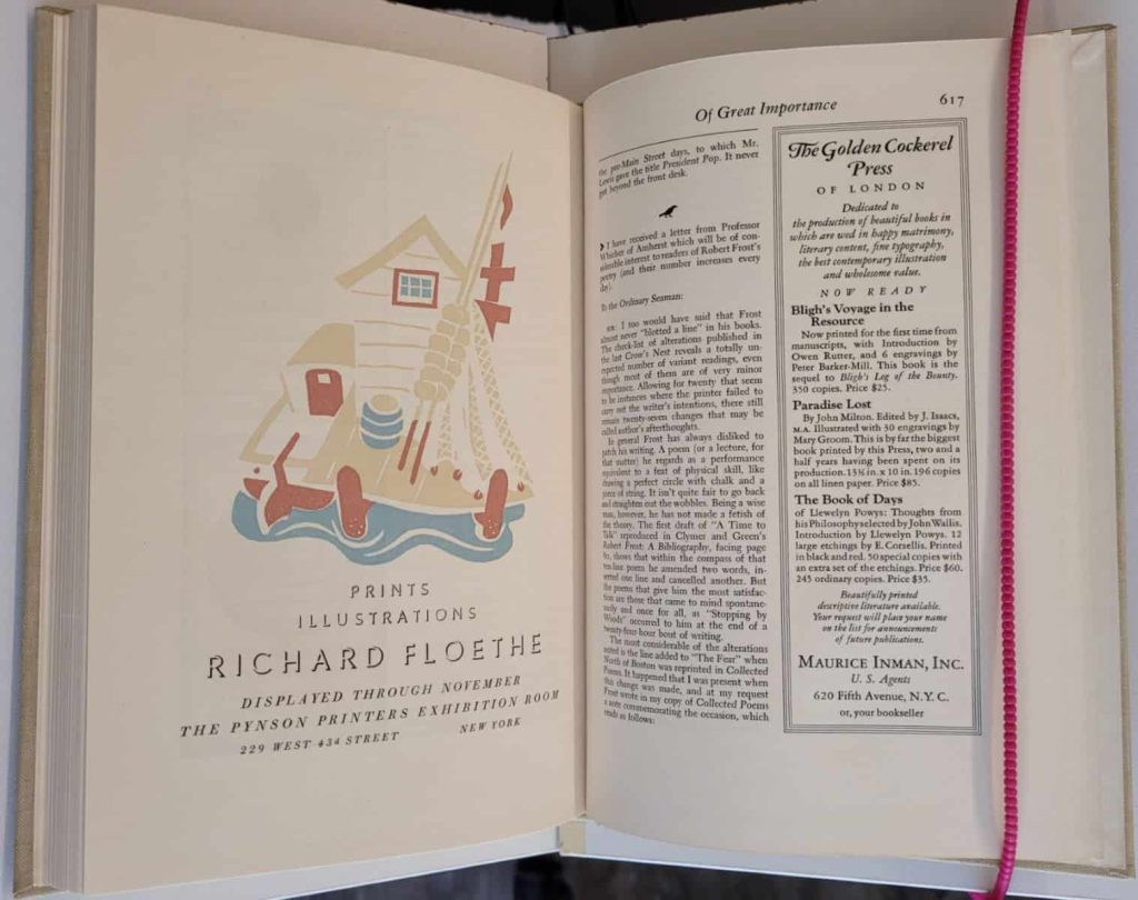
showing a sailing theme by Richard Floethe
Summer Holiday Publication Announcement
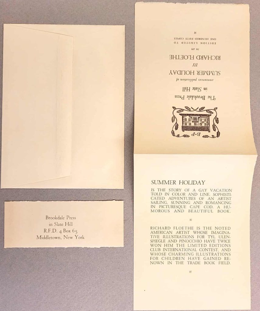
publication announcement by Brookdale Press.
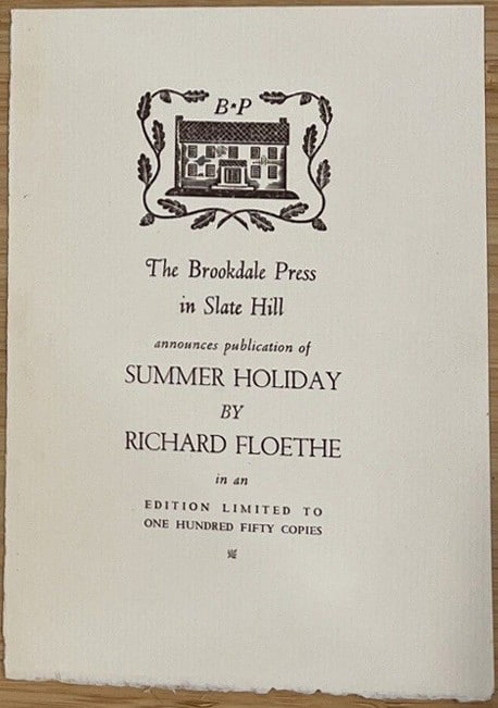
publication announcement limited to 150 copies.
Summer Holiday 1939
Summer Holiday is the story of a gay vacation told in color and line. Sophisticated adventures of an artist sailing, sunning and romancing in picturesque Cape Cod. A humorous and beautiful book.
From the announcement put out by Brookdale Press.
- Title: Summer Holiday
- Author and Illustrator: Richard Floethe
- Year: 1939
- Publisher: The Brookdale Press
- Place of publication: Slate Hill
- Printer: The Brookdale Press?
- Copyright: The Brookdale Press
- Binding: hard cover
- Cover: paper covered boards with sailboat image on front cover,
- Language: English
- Edition: Colophon states limited to 150 copies; signed by the artist and numbered
- Description: slipcase, 21 cm, 31 ff.,
- 30 images with black line drawings by lithography then hand-coloured in shades of pink and blue.
- All three edges cut; brownish-black top tint
- Printed recto.
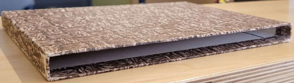
Summer Holiday: a summer romance.
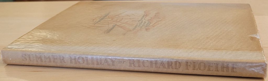
wordless novel, Summer Holiday.
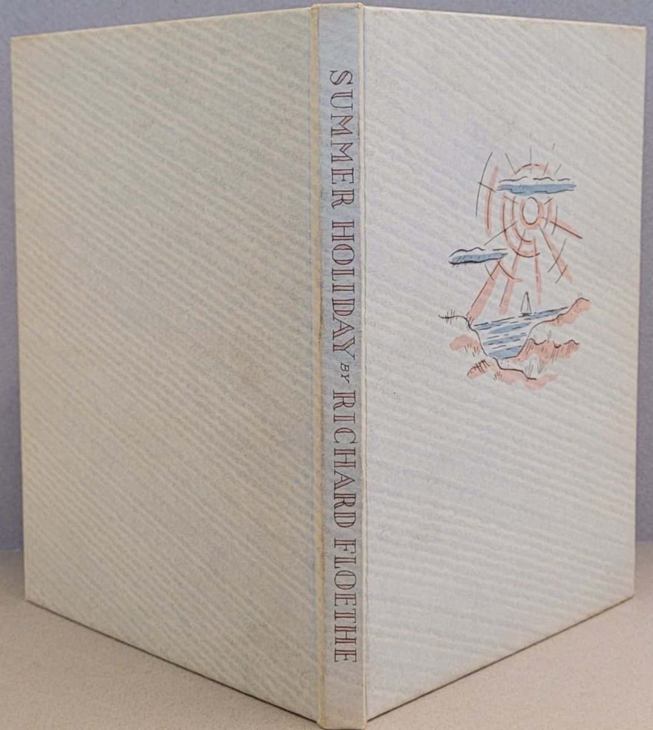
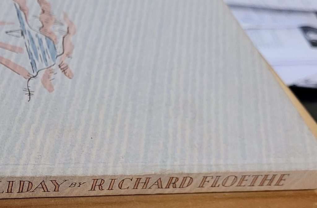
showing the spine with front and back covers.

wordless novel, Summer Holiday
– paper appears to be a laid paper.
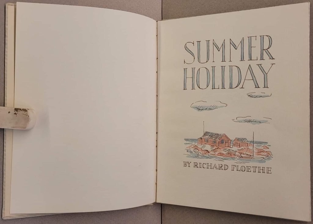
wordless novel, Summer Holiday.
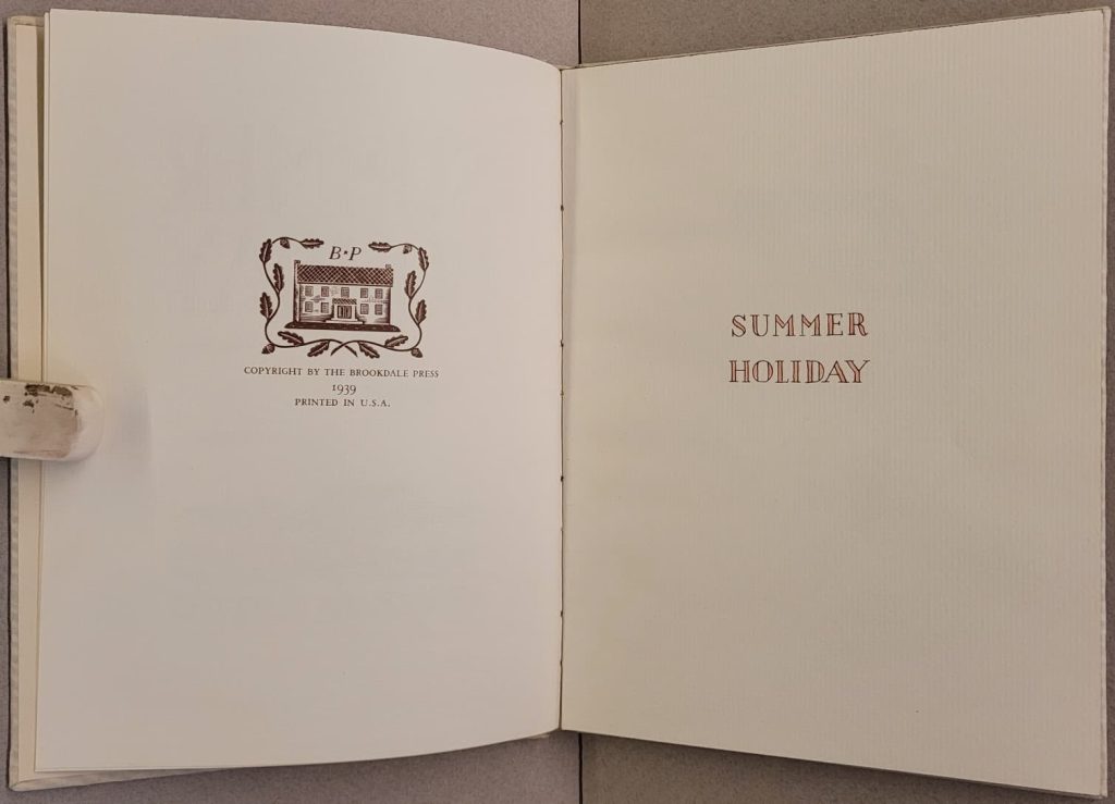
of Richard Floethe’s wordless
novel, Summer Holiday.
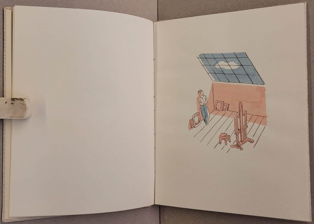
Summer Holiday. All images printed recto.
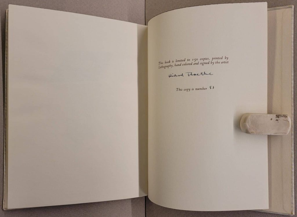
Summer Holiday. Signed and numbered
by the artist.
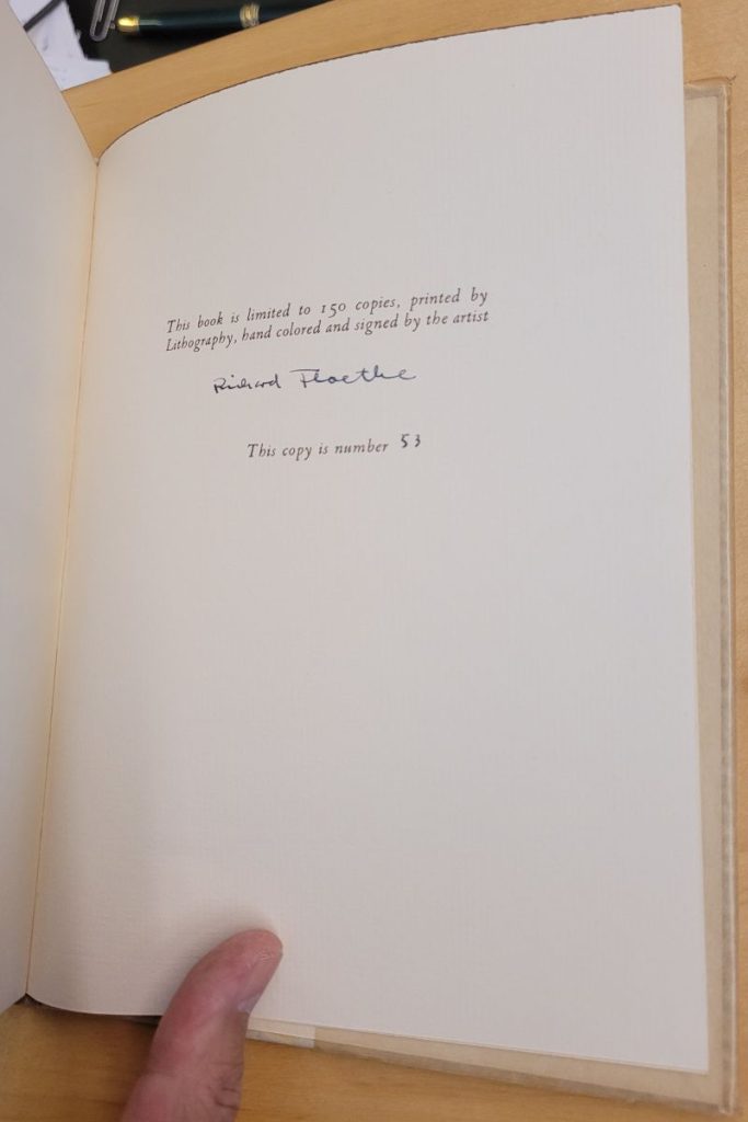
novel, Summer Holiday. Limited to 150 copies printed
by Lithography, hand colored, signed,
and numbered by the artist.
Sample page with variations
The black lines in the images were printed by lithography. The pink and the blue for the images was hand coloured by the artist (presumably with water colours). Typically when a book is published, extra copies are made to allow for mistakes or damage in the assembly. Assuming an extra 10 for the overrun, that is 160 copies, each with 30 images ie 4800 sheets, most of which have two colours. With that number of pages being hand coloured, one can expect variations from one copy to the next.
In the examples below, the blue could have been done using a stencil BUT given the wide variation in the patches of blue it looks like it has been done free hand.
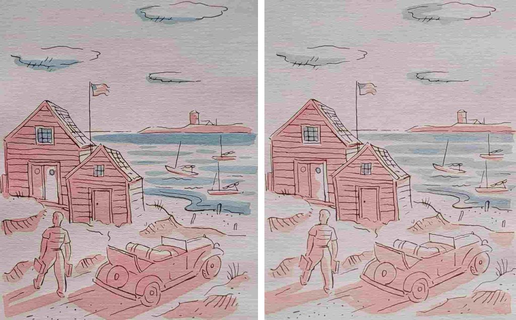
53 of Richard Floethe’s wordless novel,
Summer Holiday.
The pink in this example has white areas surrounded by pink so clearly a stencil would not have been used for everything. Even where a pink stencil could have been used, there is too much variation so the assumption is the pink was also done freehand.
Floethe’s sons have put up a short video that sets the story to music. Click HERE to see it.
Boards
The boards are covered with off-white paper with mottled light-blue diagonal lines. The front cover has a blue-and-pink illustration, and the spine lettering is filled in pink. The book illustrations are black-line lithos with hand-coloured blue and pink. SUPPOSITION – the cover image and even the spine titling are also hand coloured.
COMMENTS
If you disagree with something on this page, have an improvement, or have any other comment please email
wn at wordlessnovels.com
We will give you credit for any information used.