Sometimes referred to as “libertine” or “erotic art”, Rojan’s (Feodor Rojankovski) sexually explicit wordless novel, Idylle printanière (Spring Idyll), is told in 30 black and white lithographs augmented by hand with coloured pencils.
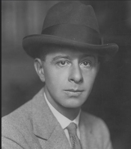
Feodor Stepanovich Rojankovsky (1891 –1970), commonly referred to as Rojan, was a Russian émigré who moved to France in 1925. In addition to his erotic art, he is known as a writer and a prize-winning illustrator of children’s books.
In the 1920s and 30s several sexually explicit works were published, particularly in France. Due to their nature, most of these were done anonymously, but there is general agreement that Idylle printanière can be attributed to Rojan. The work is undated but is widely believed to have been published in 1934, while some sources have suggested 1933 and others 1936.
Idylle printanière is an erotic, sequential story. Admittedly, some of the images depicting various activities could have their order switched without disrupting the “storyline.” Still, for the most part, the images follow a logical story sequence, i.e., with a beginning, middle, and an end.
This is the story of an encounter at a Metro station between two elegant Parisians: a man talks to a woman on a train platform, in the taxi, there are the first sexual encounters, and then they are dropped off at a hotel to consummate their mutual desires.
A number of the images are sexually explicit.
Preliminary Drawings
In June 2025, a suite of 30 original, unsigned, coloured pencil drawings on vellum paper was sold at auction. These drawings were described as “used to produce the series of lithographs Spring Idyll “. The term “used” is open to interpretation as discussed below.
- 17 x 11 cm (image)
- 26.5 x 18.5 cm (sheet)
- mounted on individual mats.
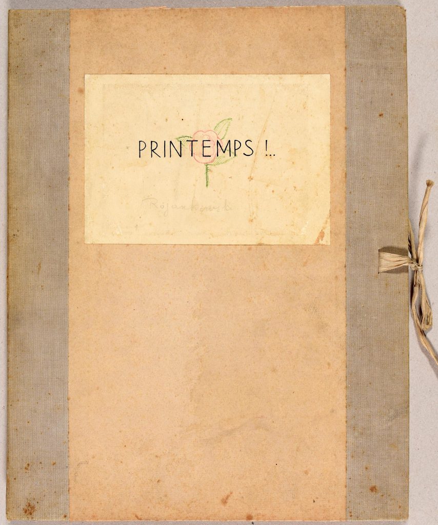
to “Spring”. Photo credit: Arenberg Auctions
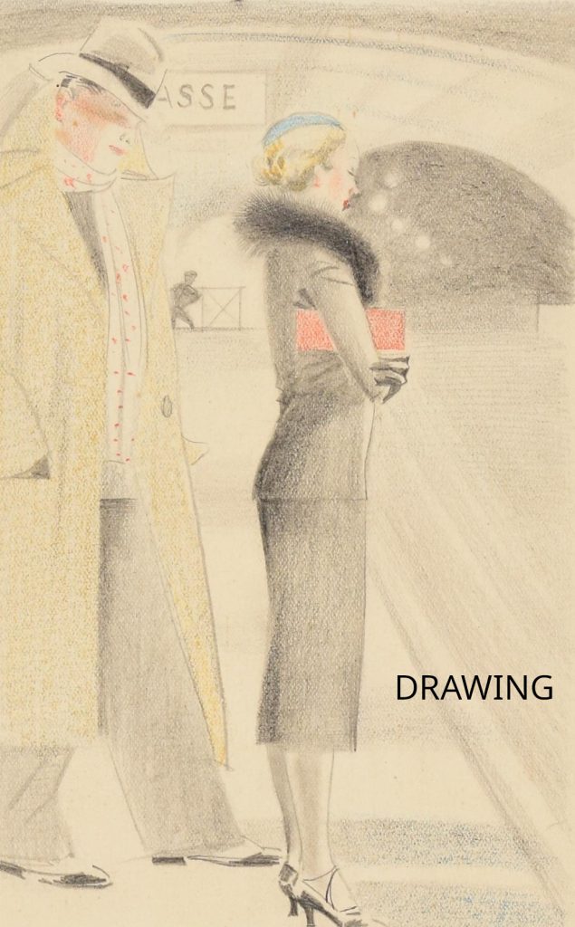
Metro Station (information credit to René Comtois).
Photo credit: Arenberg Auctions.
Clarification as to how these drawings can be said to produce the series of prints in Idylle printanière: the published lithographs differ slightly from the drawings. These drawings should be seen as preliminary drawings for the final printing of Idylle printanière – see comparison below. Presumably, Rojan used these, or similar drawings, to create black-and-white images for the lithos, then enhanced them with coloured pencils.
Some of the differences between this drawing and the published lithograph below are:
- the lights in the tunnel are different,
- the man at the exit in the background is standing in the drawing but sitting in the lithograph,
- the woman in the lithograph is facing away from the viewer while the drawing shows her in profile,
- the signs in the background are different,
- etc.
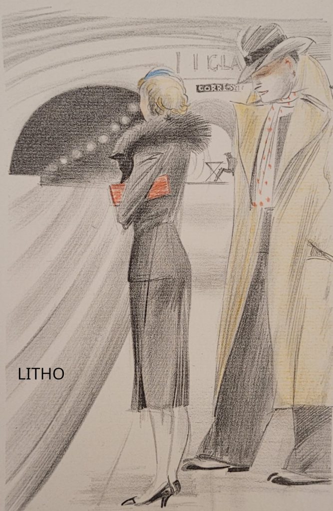
litho is reversed compared to the drawing.
1st edition of 516 copies c.1934
- Title: Idylle printanière (translated: Spring Idyll)
- Author: not stated but widely believed to be Rojan – Feodor Stepanovich Rojankovsky
- Illustrator: not stated but widely believed to be Rojan – Feodor Stepanovich Rojankovsky
- Date of publication: widely believed to be 1934, but some sources suggest 1936 or 1938, and the 1993 Erotic Print Society (below) gives a date of 1933.
- Publisher/Printer: neither are stated but some suggest Henri Pasquinelli based on the stylized initials “HP” signed on the justification/limitation label (this attribution needs more before it can be relied on).
- Place of publication: not stated
- Copyright: Artist?
- Dimensions:
- Folding cardboard case: 33.5 x 26.5 x 2.5 cm
- passpartout folders: 32.4 x 24.8 cm (12 3/4 x 9 3/4 in.)
- Sheets: 28 x 18.7 cm (11 x 7 3/8 in.)
- Images: 17 x 11.7 cm (some variation)
- Binding: sheets and frontis are loose in the case; the case is very heavy card with a cloth spine; closed with a ribbon tie.
- Language: French titles, etc
- Unpaginated except to the extent the individual passpartout folders are numbered in pencil, 1 to 30. The numbering appears very similar to the handwritten numbers on the limitation labels, suggesting they may all have been done by Rojan.
- Edition: only the limited edition
- Printed from the original matrix: yes
- References: J.-P. Dutel, vol 2 (1920–1970), #1726, p. 207-8.
Justification du Tirage
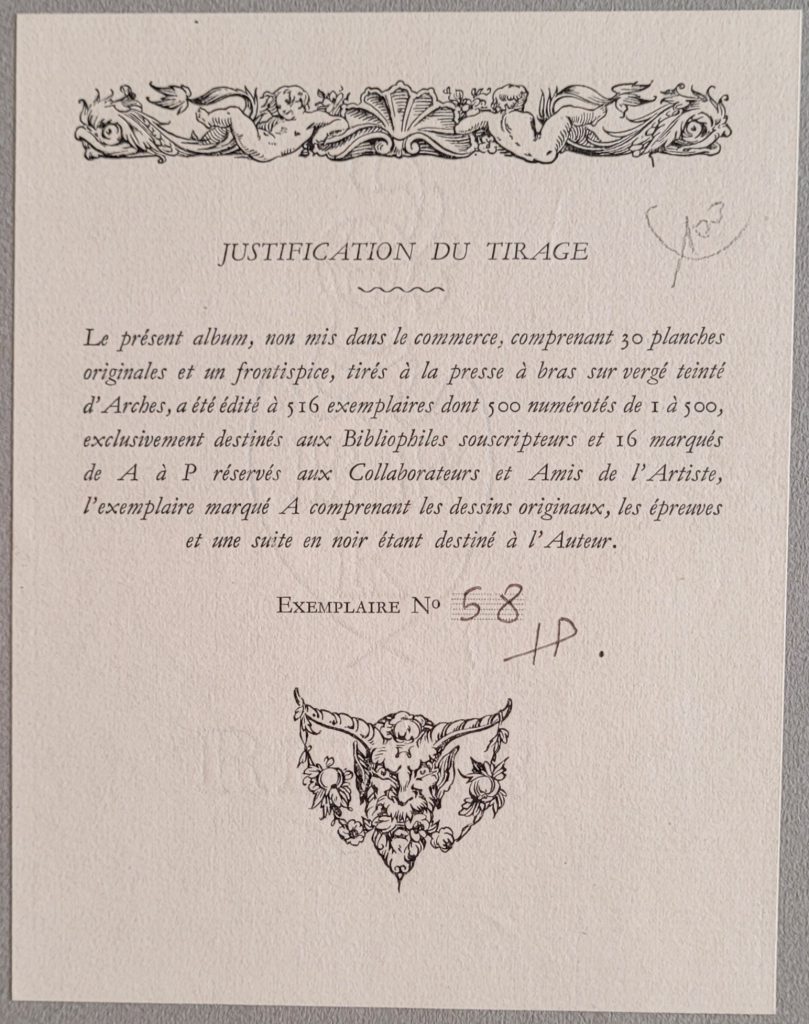
Note: only one vertical line is used for the “H”
- Translation – This album, not put on the market, comprising 30 original plates and a frontispiece, printed on hand press on tinted Arches laid paper, was published in 516 copies
- 500 of which were numbered from 1 to 500, exclusively intended for subscribing Bibliophiles and
- 16 marked from “A” to “P” reserved for Collaborators and Friends of the Artist,
- the copy marked A comprising
- the original drawings (perhaps the drawings at the top of this page),
- the proofs (an assumption – the lithographs printed in black and then hand coloured with pencil), and
- a suite in black being intended for the Author (the lithographs in black without any hand colouring).
- Several (perhaps all) labels display a watermark as above
- the watermark is not identified but it appears as if “RIVES” is typically where the satyr’s face is,
- above the Satyr, there may be a plumed knight holding a shield,
- as the label is glued to a thick card, it is not possible to shine light from the back to get a clear impression of the watermark,
- any information would be appreciated.
- the “58” and the initials appear to be done with a hard pencil
- In this example in the upper right, there is a notation, “103,” that may be in the hand of Rojan, but the significance is unclear
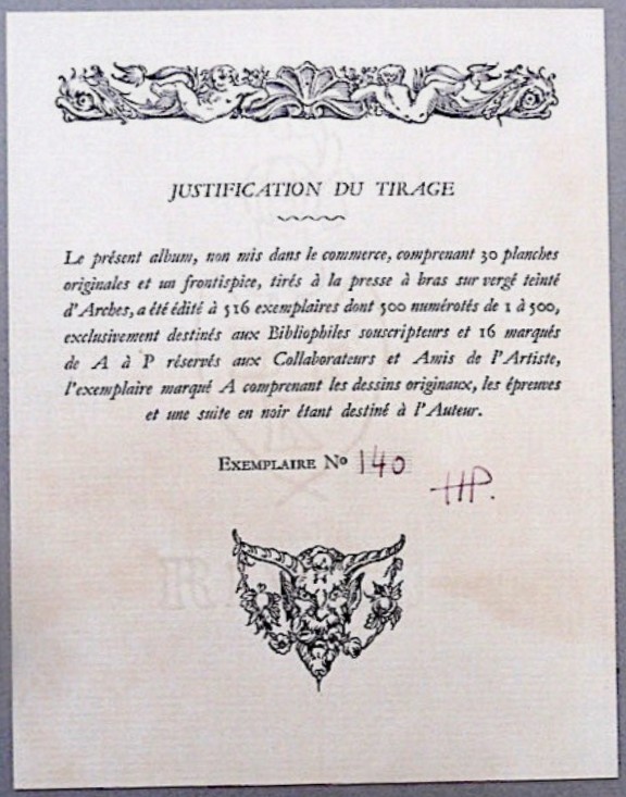
Stylized HP Initials
- the stylized initials are believed to represent “HP” for Henri Pasquinelli
- some say HP is the publisher,
- others suggest HP is a further pen name of Rojan.
- Some of the limitation labels are as above, with a single vertical line forming the left vertical of the “H”. Other copies use two vertical lines for the “H” as below. To date, of the 11 labels observed, the three numbered under 100 have only one vertical line as above, while the eight numbered above 100 have two vertical lines.
Details
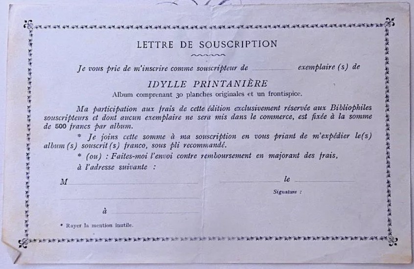
roughly US$1500 in 2025 dollars. Image source: unknown
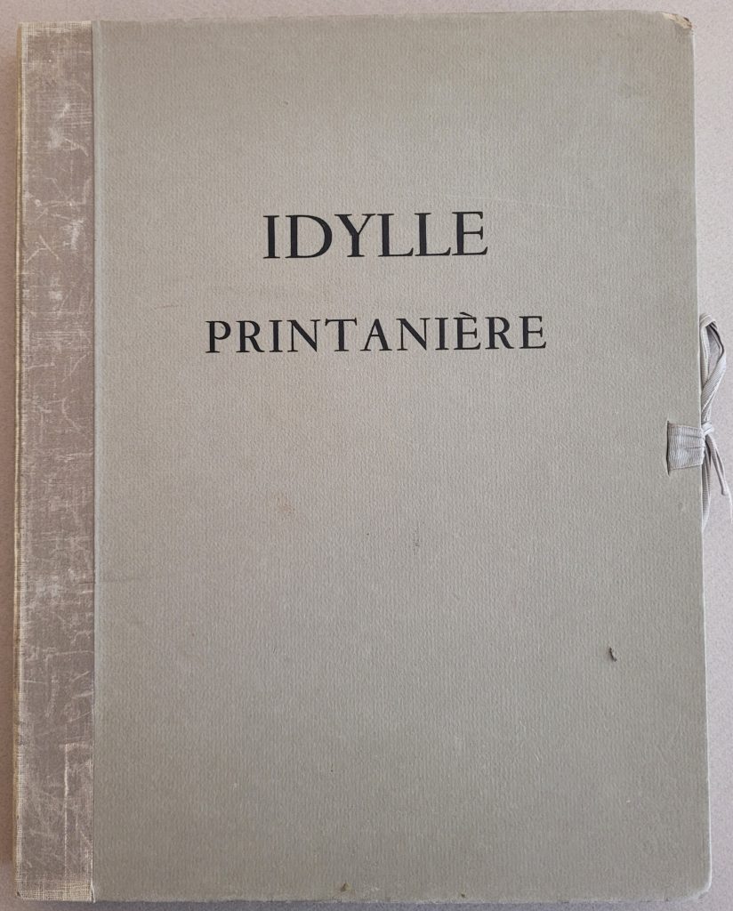
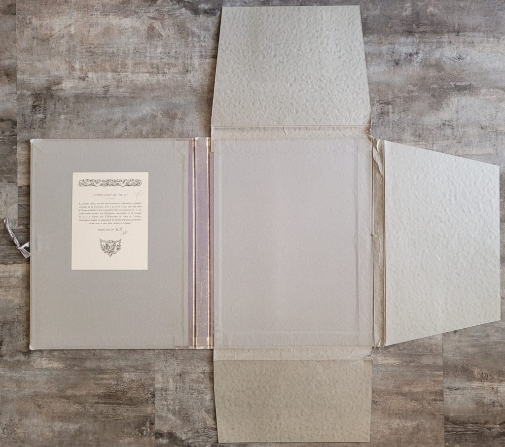
label pasted to inside front cover.
Frontis
It is generally accepted that the print series was done as a black and white litho and then hand-coloured with coloured pencils. Some dealers suggest the frontis is a mulit-coloured lithograph.
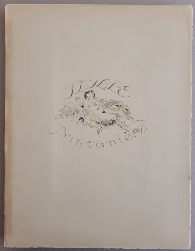
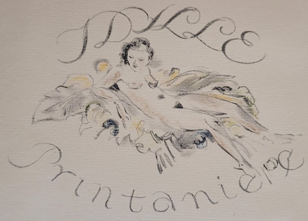
Multi-colour frontis: on a handpress, the black and each colour would require registration and separate print runs. This is a lot of work, and presumably the artist opted to use coloured pencils for the 30 illustrations. It is difficult to understand why he would have taken a different approach with the frontis.
Passpartout Folders
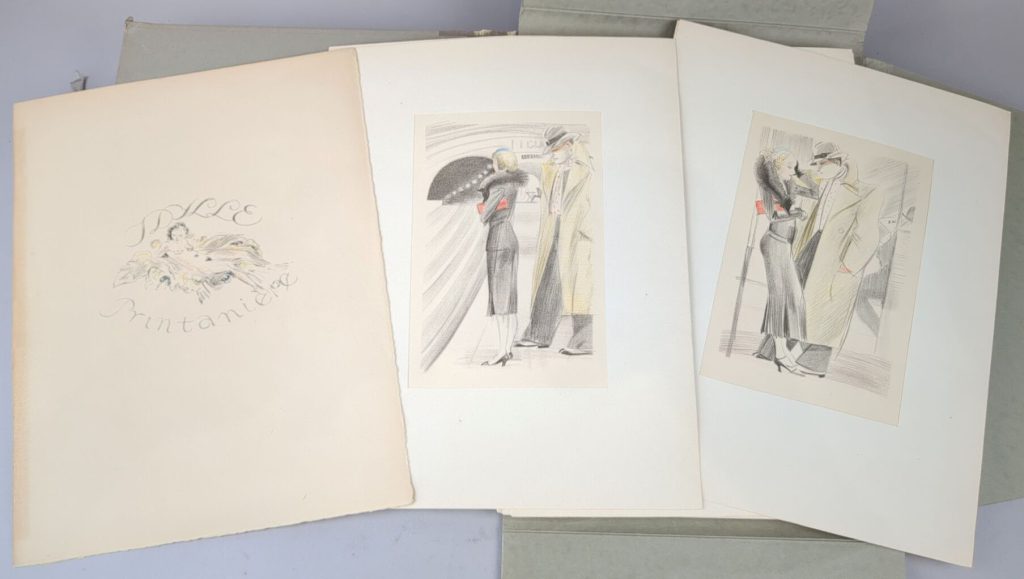
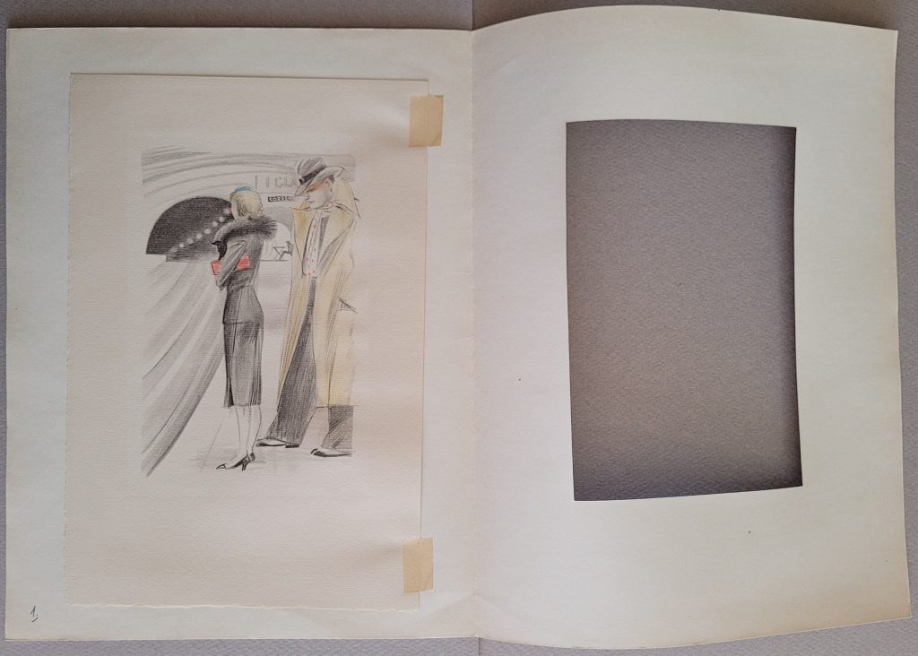
the cover can been seen more clearly to the left of the image.
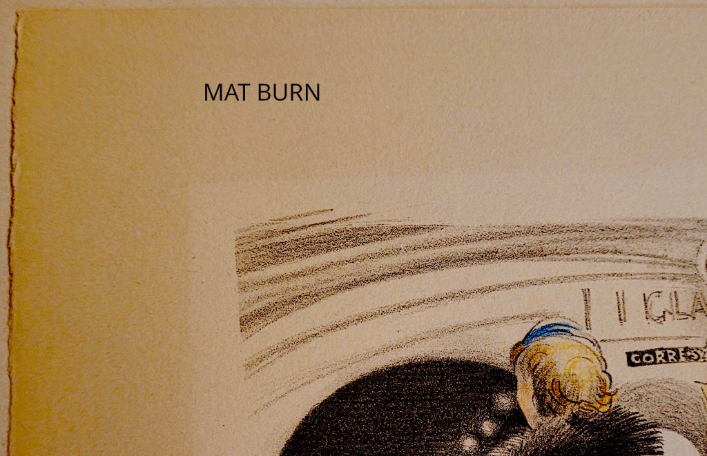
acidic folder. In this image the contrast has been artificially
exaggerated to make the burn more obvious.
Each image:
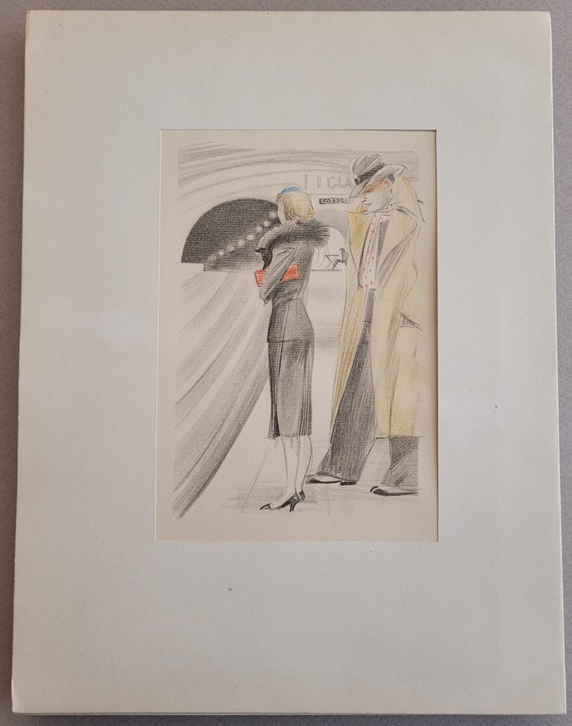
- came mounted in a passpartout folder as the above image.
- the images are taped down and the tape appears to be relatively benign
- the folder for each image is hand-numbered in pencil on the folder (not on the print), with the numbers being 1 to 30, so the associated images follow a logical story sequence
2nd Edition 310 copies c. 1938 (Pirate edition?)
There have been suggestions that this smaller and later run is a pirate copy, but given that no one acknowledges authorship, dates, printing companies, etc., this is hard to establish.
Details
The details are essentially the same as the edition of 516 copies in that:
- All the dimensions appear to be roughly the same (based on dealer’s listings),
- All the images are held in individual passpartout folders
- all the images are hand-coloured with coloured pencils like the earlier edition of 516 copies
Some differences
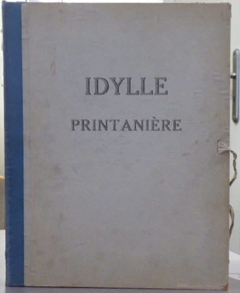
- The folding case has a blue tape spine vs the gray spine of the earlier edition
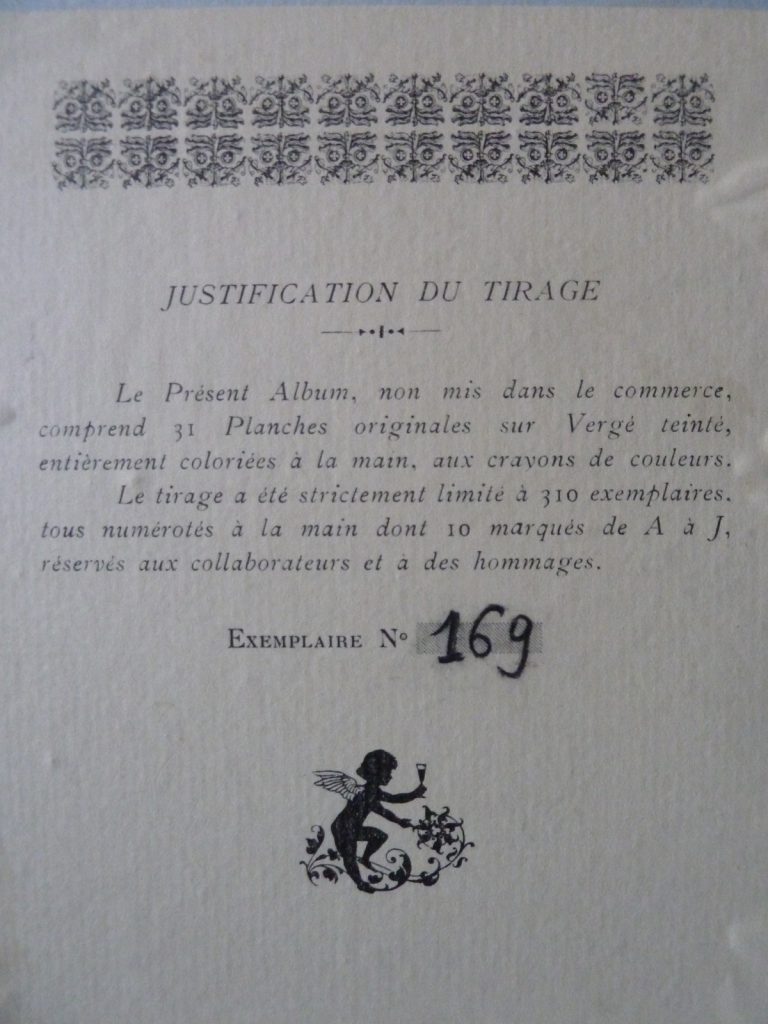
The limitation label is hand-numbered but it lacks the stylized initials “HP” of the earlier edition.
- limited to 310 copies vs 516 in the earlier publication
- including 10 marked A to J, reserved for collaborators and tributes
- no reference to a special copy for the artist
- the image at the bottom of the limitation is of a cherub vs. the more satyr-like image on the earlier edition.
- it is unclear as to whether the passpartout folders are numbered
- on the few examples available on the internet, it appears as if the cutouts in the passpartouts are more ragged compared to the 516 edition
Later publications
1965 Danish
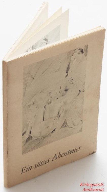
Ein susses Abenteur (translated: A Sweet Adventure)
- undated but believed to be 1965
- black and white; no colours
1993 Erotic Print Society
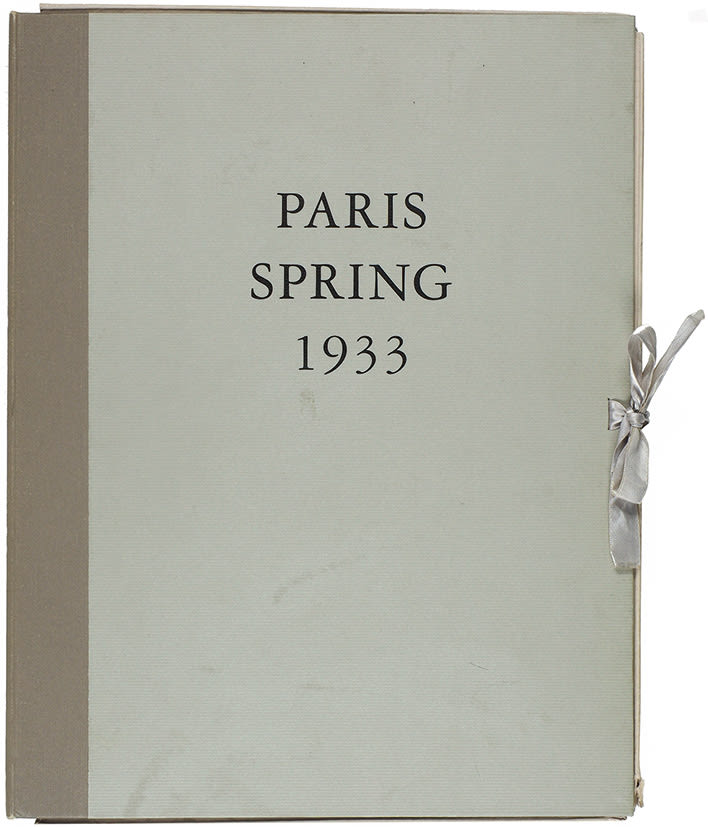
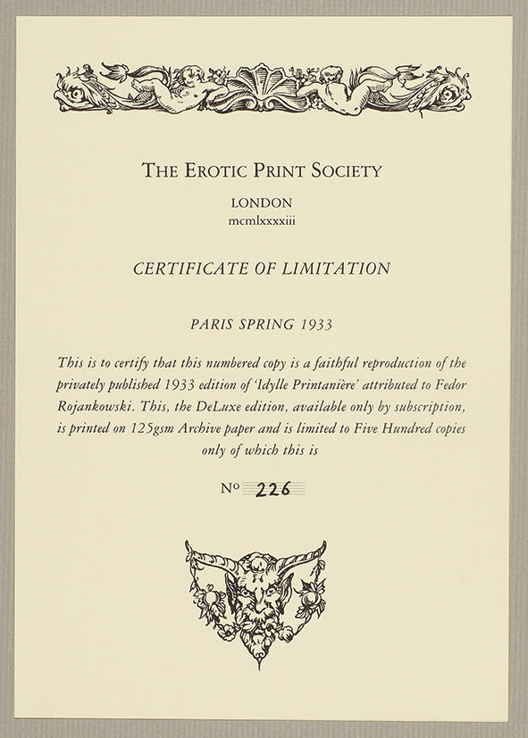
- An exact facsimile of the privately printed 1933 edition of “Idylle Printanière,” except that the title is in English. NOTE: This suggests a 1933 date, while most sources suggest the original was printed in 1934.
- printed on 125g archival paper
- available only by subscription, limited to 500 subscribers
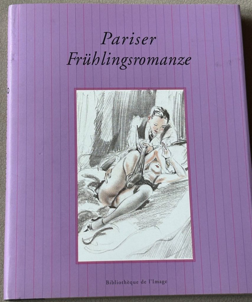
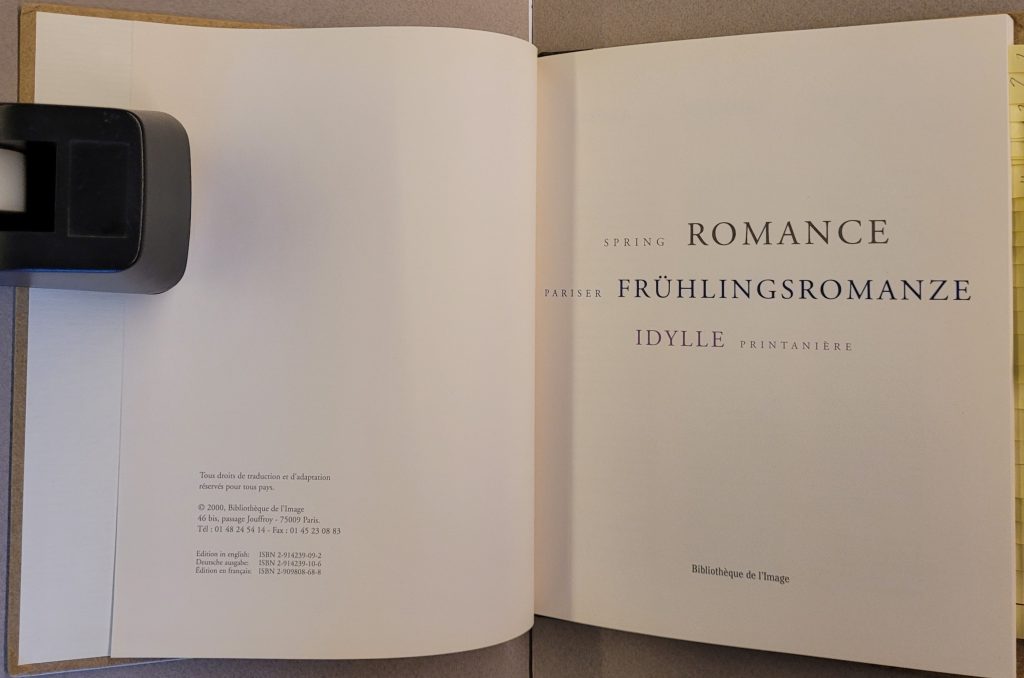
2000 Pariser Frühlingromanze (translated:Parisian Spring Romance)
- Publisher: Bibliothèque de l’Image
- Paris, France
- Preface: Richard Bocci
- In English, German, and French
- 70 pages, with 30 full-page color plates
- Hard cover, half linen with dust jacket
- ISBN 9782914239103 / 2914239106
COMMENTS
If you disagree with something on this page or have a comment please contact me
wn at wordlessnovels.com
All information used will be given a credit line.