Lynd Ward’s wordless novel, Vertigo, examines the effects of the Depression, specifically through the lives of three main characters—a girl, a boy, and a rich elderly gentleman—as their paths cross from 1929 to 1934.
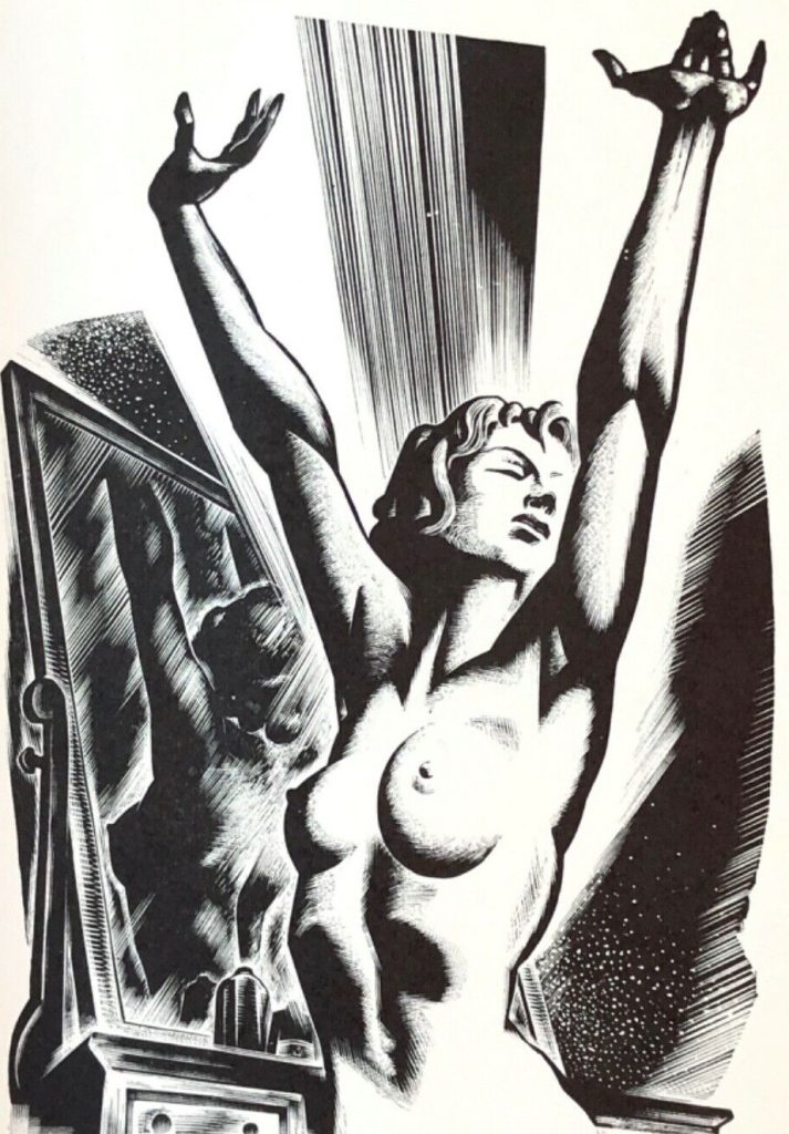
. . This book proved to be the longest of all, not only because of its more complicated story but because I was anxious to make as explicit a statement as possible. To accomplish that I broke down the action into many small steps, using several small blocks to bring the reader in close to a character so that facial expression would register more effectively the emotional response of that character to what was happening, thereby involving the reader’s own emotions more completely. The book was published under the title of Vertigo, which was meant to suggest that the illogic of what was happening all around us in the thirties was enough to set the mind spinning through space and the emotions hurtling from great hope to the depths of despair.
Lynd Ward on Vertigo
Vertigo was published in both a trade edition and a limited edition of 1250 copies, numbered and signed.
Limited Edition
Images of the limited edition are not available but believe it has:
- a white spine
- glossy bronze boards
- a slipcase, and
- the pages are uncut
IF YOU HAVE IMAGES OR INFORMATION, PLEASE GET IN TOUCH wn@wordlessnovels.com
Trade Edition
- Publisher: Random House
- Place of Publication: New York
- Copyright: Lynd Ward
- Unpaginated
- 230 b&w engravings
- First edition.
- Octavo [21 cm]
- Top edge tinted black (some refer to this as “publisher’s top stain”) – some copies look gray, but query if this is just a faded black
- dust jacket
- There may be more than one printing – images of the 2nd printing are appreciated – photo credit will be given wn@wordlessnovels.com


Colour of the cloth cover on the trade edition
The cover is printed cloth with black (sometimes appearing very dark navy) and gold spiral- and star-patterned decorations on the boards.
Some dealers say the cover is black, others say blue, and others Navy blue – this may be a function of toning over the years.
The other discussion is whether the blue is the basic colour of the cloth onto which a yellow/gold has been overprinted, OR
is the basic cloth yellow/gold over which the blue has been printed. The image below suggests the blue has been printed over the gold cloth.


Condition issue: many copies have toned end papers. This would appear to be a reaction to the glue used on the paste-down.


page is the publisher, Random House Inc.

COMMENTS
If you disagree with something on this page, have an improvement, or have a comment, please get in touch with me
wn at wordlessnovels.com
Any information used will be given a credit line.