Patri’s only wordless novel, White Collar, was a response to the Great Depression and his belief that blue-collar and white-collar workers should be united.
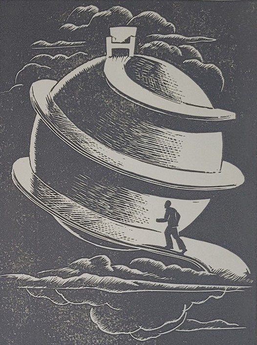
Giacomo Giuseppe Patri
“Giacomo” is pronounced “jackomo” with the “j” as in “judge”.
White Collar editions
Some dealers say the story is made up of 122 linocuts; others have said 128. If you have the patience, please count the images and advise.
In addition to the three editions of 1939/1940/1941, there are at least the following:
White Collar 1975 and later editions
- 1975 Reprint by Patri – Celestial (Ten Speed)
- 1987 Private edition?
- 2007 Col Blanc Zones French publication
- 2016 Dover Publications
Giacomo Patri’s biography
- June 9, 1898; born in Arquata Scrivia, Piedmont, Italy
- Age 14 months, stricken with polio, leaving the left leg useless and the right leg weak.
- In 1907, Patri’s father, Antonio, emigrated to the United States, settling in San Francisco
- 1916, Patri emigrated from Italy to San Francisco
- In his youth, Patri had various jobs as a tailor, barber, and bookkeeper
- c. 1918 – 1920 Patri began making signs and then doing illustrations for Advergraph Advertising Co.
- 1920s Patri enrolled in art courses at the California School of Fine Arts (now, the SF Art Institute),
- 1926 Patri married Stella Nicole, a fellow student at the California School of Fine Arts (a marriage that was not ideal).
- they had three children: Peiro in 1929, Remo 1931; Tito 1933
- Patri worked as an illustrator for various publications
- In the 1930s, Patri began to draw for Communist Party publications
- 1937 – 1944 Patri drew illustrations for SF Chronicle
- 1939 + 1940 Patri printed two handmade editions of White Collar; and the 1941 Pisani edition
- 1948 Patri opened the Patri School of Art Fundamentals (an art school for the working people) and taught until it closed in 1968
- 1961 Patri divorced Stella
- 1969 Patri married Tamara Rey
- 1978 Patri died of liver cancer (a son attributed the cancer to Patri’s habit of licking the tip of his brush to give it a finer point thereby ingesting carcinogenic ink)
The above details are mostly obtained from a biography by George Rey; see Rey, George San Francisco’s Cultural Ciopino; Italians, Artists and the Left in San Francisco. 1910-1970 for an in-depth biography of Patri.
White Collar background
According to Patri’s biographer, George Rey, White Collar is largely autobiographical, except that the artist did not lose his house to foreclosure.
Misery was on all sides of us. Uncertainty and fear pervaded everywhere, and I, who had just left Art School, could not find a job. …A conversation with a neighbor who had lost his house convinced me that if labor was more united it could vote unanimously for politicians who would bring about a happier state of affairs for all of us. But in this area I realized that the principal division seemed to be between white collar and blue collar workers, the former traditionally not wanting to be considered workers;
From the introduction to the 1975 edition of White Collar (Celestial Arts), Patri speaks about the Depression Era and the origins of the idea for his book.
David Beronä in Wordless Books, The Original Graphic Novels; 2008 points out four important aspects of White Collar:
- the blatant use of words on buildings, flags, etc,
- page design,
- use of Christian icons and symbols, and
- dream sequences.
Changed Dedication
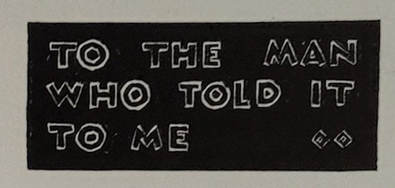
- 1939 1st edition dedication: TO THE MAN WHO TOLD IT TO ME
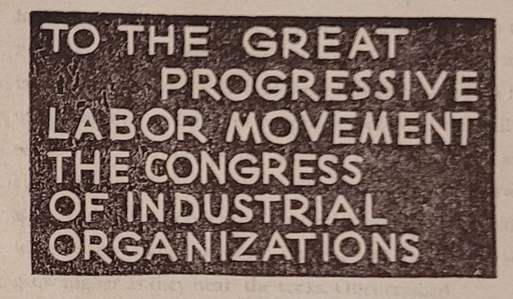
- 1940 2nd edition dedication: TO THE GREAT PROGRESSIVE LABOR MOVEMENT THE CONGRESS OF INDUSTRIAL ORGANIZATIONS
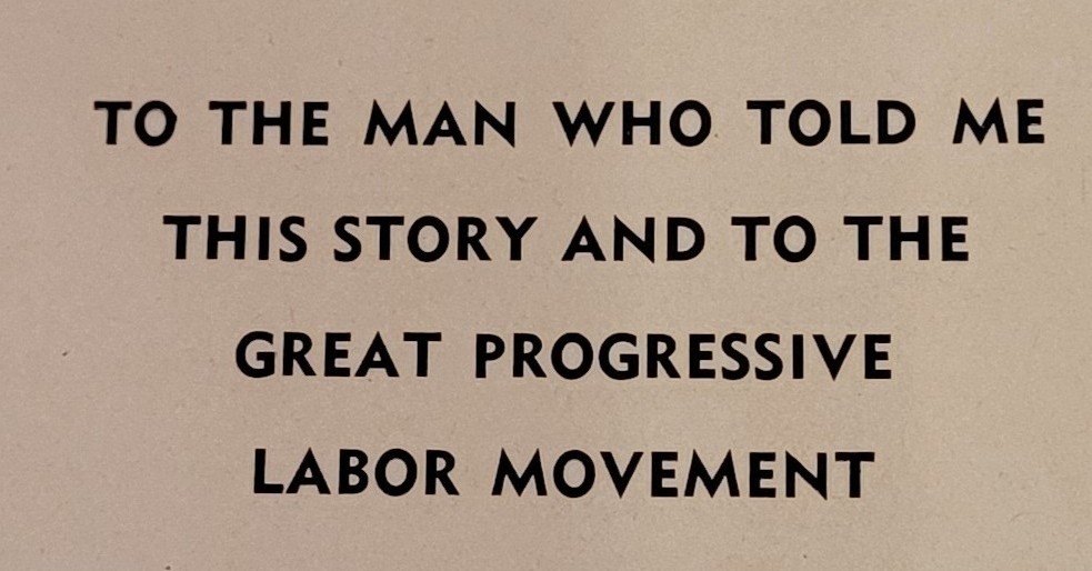
- 1941 3rd edition (Pisani) dedication: TO THE MAN WHO TOLD ME THIS STORY AND TO THE GREAT PROGRESSIVE LABOR MOVEMENT
Changed Colour of “fantasy” Sequences
Patri borrowed a technique from Lynd Ward, who printed images for the storyline in black and used a different colour (orange in Ward’s case) to print images reflecting the subjective or the interior workings of the protagonist’s mind.
For the White Collar 1st edition, Patri used a gray ink for the fantasy sequences.
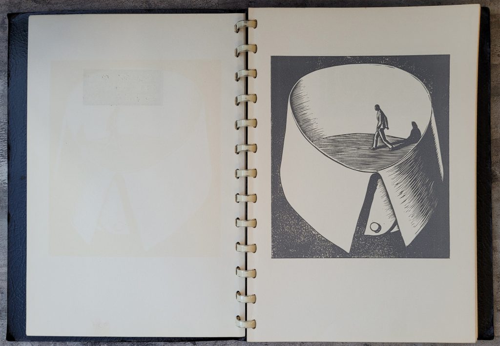
Patri changed the fantasy images to orange in the 2nd and 3rd editions.
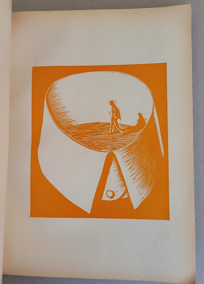
This is supposition, perhaps using black ink for the main story and a medium gray ink for the fantasy images was too subtle for many readers, so Patri used an obviously contrasting colour. One may like the subtlety of the gray; if readers don’t get it, Patri was right to change.
Also
Click on these links for blog discussions on Variations between editions of White Collar, binding types, edition sizes/dates, or the missing John L. Lewis Epilogue.
COMMENTS
If you disagree with something on this page, have an improvement, or have a comment please contact me
wn at wordlessnovels.com
Any information used will be given a credit line.